Wednesday, 7 September 2016 · 2 minute read
Today Apple announced the iPhone 7 and while it may seem like an incremental upgrade, especially if you’re rolling with the iPhone 6S, here are a few reasons why this year’s iteration may prove to be more of an ugprade than it seems.
Longer battery life
Apple touts that this year’s iPhone should last an extra 2 hours over last year’s version. That’s a pretty big jump, especially if you’re like me where you’re always on the lookout for a ligntning cable, even for just a few minutes, to get you through the next hump of the day. That extra 2 hours will be a godsend. I’m often running near empty when 5pm rolls around so this will be a welcomed change. Sure I carry around a small battery pack and lightning cable, but as Murphy’s Law would dictate, I often find being busy throughout the day, forgetting to charge, just when I realize I’m not heading home after the office and am left with a dead phone.
Stereo sound
Over the past year I’ve found myself using the iPhone’s speaker to listen to music and podcasts more often. Whether I’m cleaning up in the kitchen, doing some chores around the house, I’d rather listen through the speaker than have something in my ears. The improvements to the sound due to two speakers will certainly increase the experience for anyone who’s in the same boat. I’ll take the removal of the headphone jack for stereo sound anytime, bring it!
Better camera
At this point it’s a given that every year Apple will improve the camera. While I’m disappointed the 7 didn’t get the dual-lens of the 7 Plus, the 7 does have features that most people who have refused to move up to the Plus series will welcome.
First, the 7 includes the optical image stabilization that the 6 Plus and 6S Plus have included for the past two years. Second, the newer camera sports better low-light performance, lower f/1.8 aperature and overall better image quality.
I find myself carrying less and less my Olympus E-M10 mirrorless camera system. Instead I favour of the portability of the iPhone and it’s ability to quickly capture the moment when it arises. With these additions to the 7 and some of the features from the 6/6S Plus coming along for the ride, this will only make my pictures on the iPhone even better, further reducing the need for that mirrorless camera.
Better screen
While we didn’t quite get the iPad Pro’s true-tone display, we did get a new screen with a wide color display (P3) that’s also brighter. Pictures, videos, apps will pop with the new screen. Here’s to hoping next year’s iPhone brings true-tone.
Water resistence
The new iPhone is now water-resistence at IP67. It should be noted that this is great for iPhone-lovers everywhere but isn’t a breakthrough on the market; make note that Samsung’s Galaxy S5 sported the same water-resistence rating of IP67.
This shouldn’t be confused with water proofing which Apple has not yet bestowed the iPhone (maybe in 2017?). However, this will make the new iPhone more resistent if accidentally dropped in certain pools of water that shall remain nameless, or just getting caught in a downpour.
Our family has a pool and this will be a welcomed addition. Earlier this summer, a certain family member dropped their iPhone 6S into the pool (about 3 feet). The iPhone was still on when it was taken out, but even after turning the phone off and letting it stand for 4 days, the iPhone would not power back on. Oh, and for our Canadian winters, the water resistence will certain be a boon for the times your phone may take a tumble in the snow.
Double the storage, same price
The iPhone 7 in Canada starts at $899 for the 32GB version, $1029 for the 128GB and $1159 for the 256GB version. If you’re a moderate user who requires more than 32GB, you’re getting 64GB (or 128GB) more memory than last year for the same price, and who doesn’t want (need) more space?
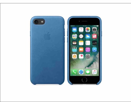
New case / color combinations
Ok, so this may be more of a personal taste, but I can’t say I disklike how I can now match my iPhone and case with the theme of this site (at least for this year).


